Throughout North America, the regulations for displaying cannabis in stores vary from apothecary-style shops where product can be weighed, inspected and bagged at the counter to the overly-secure, appointment-only dispensaries where customers are required to bring their own state-approved lockbox to transport the product off the premises.
Even in most recreational stores, cannabis cannot be displayed the same as traditional retail products. But while the industry may still be years away from having elaborate window displays, the race to modernize cannabis retail stores is forcing many operators to keep up with the times.
“There’s this whole anti-establishment vibe to the (cannabis) culture, but the establishment is what’s being successful,” says Anne Marie Luthro, the owner of AML Insights, a retail strategy and shopper insights consulting firm. “One of the first hurdles is that a lot of these retailers, which are small and independent, take what they can get instead of looking for something that works.”

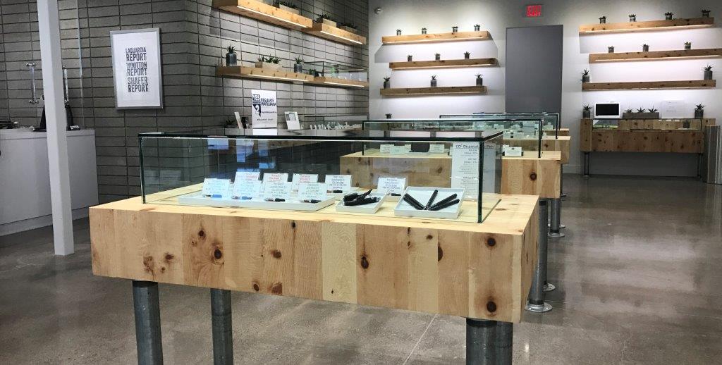
The uniform table and wall displays at The+Source in Las Vegas use spacing and simple signage to great effect. Photo courtesy of The+Source.
Accessible Displays
Cannabis stores currently have a much higher conversion rate than most retail sectors, meaning the vast majority of shoppers who enter a store leave with a purchase. But shopping experts such as Luthro say stores can increase the average customer’s purchase by improving the way products are displayed and by letting the packaging do the talking. Shops may also be able to generate more repeat business with more effective displays.
For example, glass counters are often an easy and inexpensive solution to display product, while satisfying state regulations. However, the rest of the retail world is finding innovative new ways to display products and moving away from the classic counters.
“The reason retailers are getting a great deal on these (glass counter) fixtures is because they’re outdated; normal retailers aren’t using them anymore,” Luthro says. “You do all this work to build these beautiful stores and then when people get to your product, they’re forced to stare directly down.”
Impulse Shopping
In 2008, the marketing agency Ogilvy released a study it conducted of more than 6,000 shoppers, revealing that promotional displays drive more impulse purchases than price reductions. The displays analyzed by Ogilvy were not elaborate productions; in fact, many were simple cardboard stands that placed the product outside the uniformity of the aisles shoppers usually peruse.
The study showed that 29% of consumers made purchases that were categorically outside their reason for visiting the store and 24% of that group reported the purchases were prompted by in-store displays. The study also showed that 39% of consumers enter a store with the idea of the product they want and choose a brand based on price, demonstrations, displays and packaging. Ogilvy also found that in the case of convenience store snacks, 49% of purchases were initiated by displays.
Luthro conducted a study on sunglasses, which are commonly displayed in a similar fashion to cannabis, to see how the shopping experience changed when the merchandise was lifted higher and removed from its cases. The study found that sunglasses were suddenly more interesting to shoppers, and sales increased at the store. She found that part of the problem was customers not feeling comfortable browsing when they needed to ask a sales associate every time they wanted to try on a pair of glasses. Luthro recognizes that most regulations prevent cannabis from being displayed out in the open, but she says lifting the product to eye level can lead to more sales and repeat business.
“There’s an old saying, ‘In fixtures and signage: Knees and below, no go,’” Luthro says.
One of the best ways for retailers to create a more engaging environment for shoppers is to incorporate vertical fixtures into the design, Luthro says.
However, if that’s too much of an investment, a few simple adjustments can improve existing displays. Luthro suggests facing the product at an angle, so shoppers can see and identify it from a greater distance. She also recommends displaying empty packaging at eye level around the store so consumers can learn about the product at their own pace.
“When you give something height, you give it importance,” says Linda Cahan, a retail design consultant for Cahan & Company.

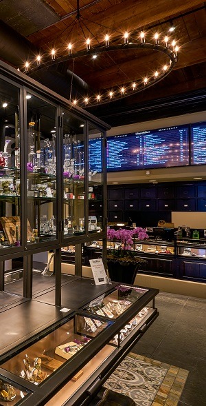
On the sales floor of Diego Pellicer, well-lit, eye-level and waist-level fixtures give customers the same independence they would find at non-cannabis retailers.
Adding vertical displays to the store not only keeps heads lifted and eyes moving, but it also creates a visual break that prevents shoppers from feeling intimidated. As in Luthro’s sunglasses experiment, when customers are not intimidated, they browse more and ultimately buy more.
“‘Overwhelmed’ is a big emotion, especially for newer shoppers,” Luthro says. “Even if you’ve been smoking (cannabis) for your entire life, shopping for it is really different.”
Order from Chaos
Eric Feigenbaum, president of Embrace Design and one of the world’s leading authorities on visual merchandising, explains how the sensation of being overwhelmed can prevent customers from focusing on any of the inventory and even stop them from shopping altogether.
“It’s our job as visual merchandisers to create order out of chaos,” Feigenbaum says. “Nothing will drive a customer out of a retail store faster than seeing a sea of flat merchandise. You want to pick your spots where you want to elevate your products. In any design, even in music, it’s modulation that makes it interesting.”
Choosing what to display and where is vital inside a retail store, as it guides the consumer experience. Since the majority of shoppers turn right upon entering a retail establishment, most retailers provide an eye-level path of products to lead customers through the store. By keeping each category of product at eye level and segmented with physical or visual gaps, retailers can let shoppers know when they have hit the end of each category — not only dividing products between indicas and sativas, but even between brands, Luthro says.
Feigenbaum says lighting can also make or break consumer engagement. He suggests using four variations of lighting throughout the store: ambient lighting to provide the store’s setting; task lighting to point customers to the register or help desk; high light, the brightest of the four, to illuminate displays; and decorative lighting he calls “architectural jewelry,” such as chandeliers and sconces.

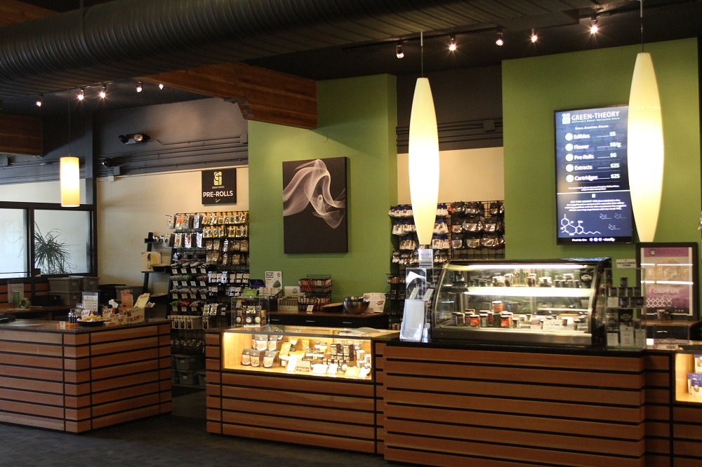
Green Theory uses visual breaks and varying display heights to avoid overwhelming shoppers and to keep displays interesting.
Fixing Fixtures
Feigenbaum says the golden rule of display fixtures is best summarized by the famous quote from architect Louis Sullivan: “Form follows function.”
“The most important part of fixturing is that it works,” Feigenbaum says. “And by work, I mean that it has to house the merchandise, display the merchandise and it has to make the merchandise accessible to the customer. Additionally — and this is key to me — is that through its design and aesthetic, it has to communicate the attributes of the merchandise.”
While cannabis products are likely going to remain under lock and key for the foreseeable future, that doesn’t mean retailers can’t provide a self-guided shopping experience. Simple displays with empty packaging, a single item with a placard description, or a laminated information card with a photo of the product can give shoppers the independence they are used to having at traditional retail stores.
“Even the most expensive diamond ring, you can put it on,” Luthro says. “Cannabis is one of the only products you can’t touch; therefore, the words and visuals need to be more on-point than in any other store.”
DeAnna Radaj, the owner and design consultant behind DeAnna on Design, says there are three core options for floor displays: the mass-out display, where a larger and less permanent fixture dominates the floor space to promote a sale that would typically relate to an event or holiday; table displays that highlight a single company or item; and lifestyle displays, which allow customers to see a re-creation of an in-use scenario of several products that complement each other.
Table displays — or speed bumps, as some merchandisers call them for their ability to slow down shoppers — should always contain an odd number of items (up to seven, according to Cahan) and orientated to the right since most consumers are right-handed. Odd-numbered displays give viewers a focal point, whereas even numbers create symmetry. Odd numbered displays compel the eyes to move around the frame of the display and then center, Cahan says.
“When you have a lot of small items, then geometry is the way to go,” she adds. “If it’s too free-form in your displays, people won’t see them because their minds are too busy trying to organize the merchandise into some form, so they can discern what they actually want to look at. But when things are geometric, the mind immediately goes, ‘Okay, so these are together.’”

Larger product manufacturers can provide interesting displays for retailers at little to no cost.
A Visual Story
Cahan says every display should tell a story. Shoppers are used to artisan brands detailing the company and process behind the products and manufacturers should be ready to supply the extra marketing items upon request.
Radaj recommends spinner racks, slat walls and small glass cubes as inexpensive and versatile options for floor displays.
But Cahan says every retailer is responsible for their own look. While it may be easy for vertically integrated businesses to design packaging that fits the theme of their stores, retailers that rely on third-party suppliers should either try to find products that work for their aesthetic or repackage the products in a display that works for their style. Such displays should carry a sort of visual garnish that anchors the feel of the store. A permanent fixture that is different, yet cohesive with the interior design, can be used to repackage out-of-place products.
For example, Cahan says, if a retailer uses a lot of wood in the store, they might want to use an unfinished metal display to juxtapose a particular product.
“You don’t want it to be all the same,” she says, “and you don’t want it to be more interesting than your merchandise.”


